
Boosting conversion: 18% more “Leave your number” submissions
Role: UX Designer
Timeline: 6 weeks (Discovery → Delivery)
Team: Product Manager, Front-end Developer, Technical Architect
Tools Used: Figma, Maze, Hotjar, Google Analytics
Deliverables: High-fidelity homepage prototype, Interactive component library (cards, modals, maps), User flows & click-through demos
Impact: (first 30 days post-launch), +24 % demo-video plays, +18 % “Leave your number” form submissions
The Challenge
3E System’s core tech lets you build without mortar or insulation 350+ climate zones, 24/7 all-weather construction. But prospects found the old site too dry, too “techy,” and buried the key value props behind jargony paragraphs.
Old site pain points:
Engineering jargon buried the benefits | Prospects asked, “What exactly is 3E?” | Homepage bounce rate: 68 %
Goals: Lift “Leave your number” submissions | Increase demo-video plays
Research & Insights Quali vs Quanti:
Qualitative Interviews
5 architects, 3 small builders: struggled to understand “what exactly is 3E?”
Pain point: “I want to see real houses built with this before I invest.”
Quantitative Web Audit
Bounce rate on homepage: 68%, only 12% of visits clicked “Contact” or “Leave your number.”
Key Takeaways
Simplify the story: prospects need a clear “Step 1… Step 2…” roadmap.
Show social proof: real projects, client quotes, hard numbers.
Create visual hierarchy: call outs for Ecology, Efficiency, Economy.
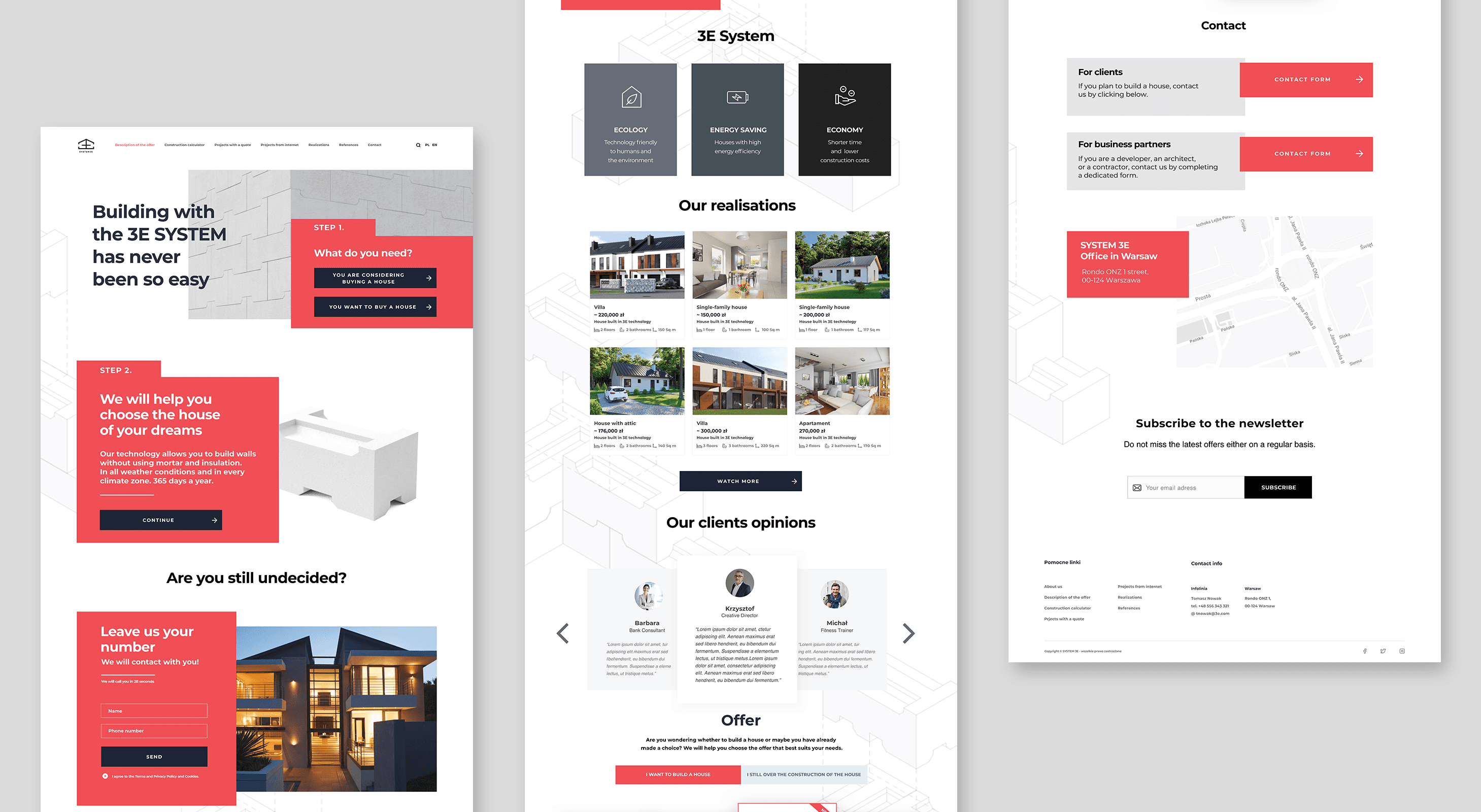
New IA Structure
Hero & Step-by-Step Entry
What do you need? → Build or BuyHow it works
You choose your dream homeLead Magnet
Leave your number → we’ll call youSystem 3E Pillars
Ecology, Energy Efficiency, EconomyOur Realizations
Project gallery + quick statsClient Testimonials
Offer & Metrics
Why now? 16 years experience, 20 countries, etc.Contact & Location
Newsletter Signup
Wireframes → Hi-Fi
• Wireframe round: sketched this stepped layout to test hierarchy
• Hi-Fi: introduced bold coral panels, minimalist icons, and high-contrast text
Results & Impact
First 30 days post-launch:
+24 % demo-video plays
+18 % “Leave your number” submissions
Business outcomes (3 months):
• Doubled newsletter list
• Secured a six-figure pilot contract
Data drives copy:
• A/B test headline vs. step-based intro
Clients crave proof:
• Expand the “Our Realizations” gallery into a filterable case-study page
Scale the system:
• Turn 3E Pillars into an evergreen design-system library for all marketing materials
