WWF
Project
2018
Challange
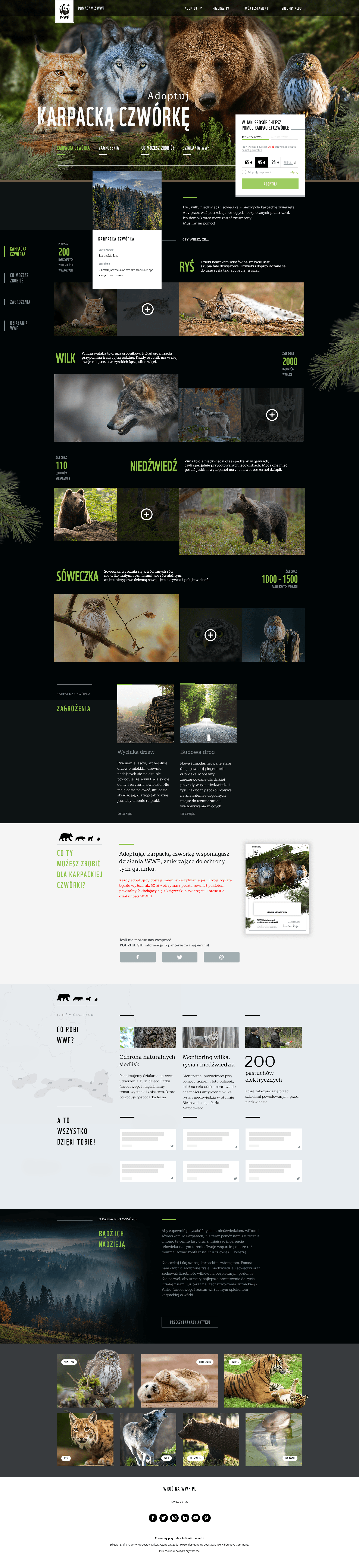
The main challenge was to create an engaging digital campaign site for WWF Polska - “Adoptuj Karpacką Czwórkę” - that would inspire visitors to support the conservation of four iconic Carpathian species (wolf, lynx, bear, and owl). The goal was to balance rich educational content, compelling storytelling, and persuasive call-to-action elements while keeping the experience clear and emotionally impactful for a broad audience, including non-digital natives.
User resarch
I started with a quick discovery phase:
• Interviews with nature supporters and previous WWF donors helped uncover motivations and digital pain points (such as unclear donation processes or confusing navigation).
• Hotjar analytics and brief surveys on the existing site revealed that users abandoned the donation flow at steps requiring too much data input or unclear CTAs.
• Key user insights: users wanted to know exactly how their adoption supports the cause, preferred minimal steps to donate, and responded best to real animal stories and visuals.
Information, Architecture
and Navigation
I mapped all content types and built a clear, tiered information architecture:
• Primary navigation allows fast access to species profiles, adoption info, threats, and success stories.
• Used sticky navigation and visible calls-to-action, so the adoption pathway is always just one click away.
• Crafted modular content blocks for quick scanning (e.g., animal fact cards, threats, and testimonials).
Visual Design and Branding
To boost emotional engagement and trust:
• Created a nature-inspired color palette with high-contrast green and dark backgrounds, drawing from the Carpathian landscape.
• Used full-bleed wildlife photography to build empathy and connect users with the cause.
• Developed visual consistency in iconography, typography, and button design to enhance scannability and reduce cognitive load.
• Integrated WWF’s branding and conservation credibility while keeping the interface modern and approachable.
Streamlined User Flows and Conversion Optimization
Designed a frictionless donation flow: one clear, persistent CTA, minimal form fields, and progress feedback. Used persuasive microcopy and inline trust signals (how donations help, security icons, success stories). Added modals for quick animal adoptions, letting users adopt directly from any section without losing context. Conducted rapid A/B testing on CTA placement, button text, and image selection—resulting in a 22% increase in click-through on “Adopt Now”.
Result
The redesigned OANDA website demonstrated significant improvements in the user experience, accessibility, and conversion rates. User feedback indicated increased satisfaction with the website's navigation and visual appeal. The simplified user flows and optimized conversion elements led to a measurable increase in sign-ups and conversions, positively impacting business growth.